In this project, we look at the diversity of The United States through different lens. We visualized racial diversity, income distribution, as well as levels of education for every state.
Using the Tableau Dashboard above, you can explore average income of every state through the map on the left side. You can also select any specific state (using the drop-down menu in the center) to view the breakdown of race, income, and education for the selected state.
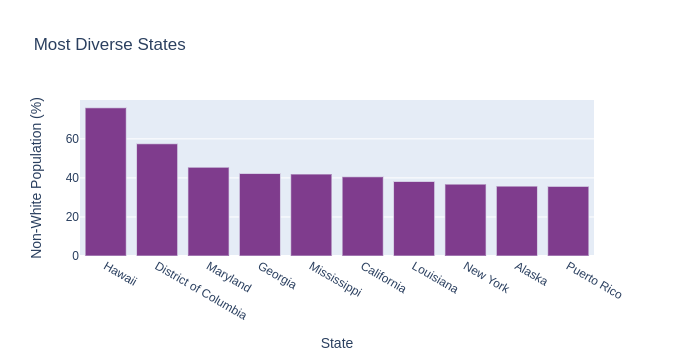
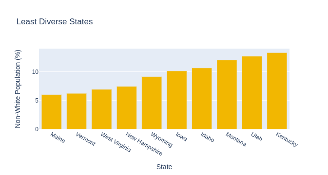
Below the Dashboard, we also visualized the top 10 most and least diverse states in America.
Process:
The data was retrieved using the government Census API.
The data was cleaned and formatted into tables using Pandas.
The tables were then exported to CSV files for easy upload to Tableau.
Once in Tableau, the data was visualized and organized into a concise Dashboard
Additional diversity visualizations were created using Plotly Express in Python.